Most service businesses sit on a goldmine of customer feedback they never truly touch. Survey responses pile up in spreadsheets, comments go unread past the first fifty, and insights that could change frontline behavior stay buried under volume nobody has time to sort through.
AI changes the math. ChatGPT, Claude, Gemini and similar tools can now handle survey analysis that used to require a data science degree or a five-figure analytics platform. Feed it hundreds or thousands of responses, and it surfaces patterns, flags urgent issues, and groups feedback by theme in minutes.
Go one step further, and you’ll find customer experience platforms with advanced AI agents specializing in customer feedback, frontline action and revenue growth.
This all matters most for multi-location service businesses. A regional manager doesn't need to know Python or build a dashboard to find out which location has a training gap or which team member keeps showing up in complaints. AI puts that analysis within reach of anyone willing to copy a prompt and paste in their data points.
This guide skips the theory. You'll get step-by-step instructions, ready-to-use prompts, and examples pulled from real service businesses across industries, all built so you can run this analysis on your own survey data today.
Survey analysis is the process of turning customer responses into specific actions your team can execute. Not summaries, not sentiment scores sitting in a report nobody opens. Actions: this location needs retraining on wait times, this team member's feedback is trending negative, this issue is costing you repeat business.
For a multi-location service business, that means understanding what customers are saying across every branch, without reading every single response yourself. It means spotting that three locations in your network mention slow check-in this month, while the rest don't. It means connecting a drop in net promoter score (NPS) at one site to a specific service breakdown instead of making guesses or assumptions.
Traditional survey analysis relies on manual tagging, pivot tables, and someone on your team reading through comments one by one. It works at a small volume, but it collapses once you're collecting feedback across ten, twenty, fifty locations. The read-through time alone becomes a full-time job, and by the time patterns surface, the moment to act on them has passed.
AI-powered analysis flips the timeline. Instead of a person scanning thousands of comments over days, you feed the data to a tool built to find structure in unstructured text. It reads every response, groups them by theme, flags outliers, and hands you a shortlist of what needs attention, in the time it takes to get a coffee.
The output is the same goal either way: know what respondents are saying, and turn it into action fast enough to matter. AI just removes the bottleneck between collecting feedback and doing something with it.
Feedback you don't analyze is feedback you paid to collect and never used. Every survey response represents a customer who took the time to tell you something, and every response that sits unread is a missed chance to fix a problem before it costs you revenue.
The financial case is direct. Unanalyzed data means missed early warnings. A customer complains about wait times, then churns quietly three months later, and nobody connects the two. Multiply that across locations and the pattern that could've been caught in week one instead shows up in a quarterly revenue report, as a number with no explanation attached.
Frontline teams need this analysis more than anyone. A location manager who knows exactly which shift is driving complaints can fix it that week and a technician who sees their name mentioned positively in feedback knows what's working and can repeat it.
For multi-location businesses, analysis does something manual review can't: it spots inconsistency at scale. For example, five locations sharing the same complaint about wait times is a training issue. One location with a single complaint is noise. Without analysis across your full network, you can't tell the difference, and you can't identify which branches are quietly outperforming the rest so you can scale what they're doing right.
The patterns are often more specific than leaders expect. Customers who mention a staff member by name tend to show meaningfully higher retention and recurring complaints about a specific process, not just a specific location, point to a systemic fix rather than a one-off coaching conversation. None of this surfaces from a single NPS score. It only shows up when someone, or something, actually reads what customers wrote.
Service businesses that act on analyzed feedback compound an advantage over time. They fix small issues before they become churn, they replicate what top-performing locations do right and they build a reputation for listening, which shows up in reviews and referrals. Competitors still treating questionnaires as a scorecard exercise are optimizing for a number, while businesses doing real analysis are optimizing for the customer relationship behind it.
Most businesses default to one type of data, usually the score. That's a mistake. The most valuable insights come from analyzing all three of the following types together: numbers show what's happening, words explain why, and patterns reveal where to act first. Skip any one of them and you're missing part of the picture.
Quantitative data is the numbers that track performance. Scores and metrics that measure satisfaction, loyalty, and specific experience attributes across every location and time period.
This data answers how many, how much, and how often. Which locations are struggling, whether scores are trending up or down and how you stack up against benchmarks, month over month or against the rest of your network.
Use it to allocate resources, set performance targets, and flag which locations or teams need support before a problem grows. It's the fastest way to see where to look.
Check out our free NPS survey template here, and our free CSAT template here.
Qualitative data is the context behind the numbers. Customer comments, explanations, and stories that reveal why a score is what it is and which specific issues need attention.
This is where the "why" lives. The exact language customers use to describe their experience, language you can reuse in training, marketing, and reviews.
This is also where AI changes what's possible. Reading through hundreds of open-ended responses used to require a dedicated analyst and days of work. Most businesses skipped it entirely and let the comments pile up unread. AI makes that same analysis instant and scalable, regardless of volume.
Behavioral data is what the patterns tell you – who responds and who doesn't, when feedback shifts and how responses correlate with what customers actually do (repeat visits, referrals, churn).
This data answers what's changing and what predicts outcomes. It catches a trend before it becomes a crisis and it flags early warning signals a single score would miss. It also connects feedback directly to the business metrics leadership actually cares about.
Service businesses use behavioral data to manage proactively – catching problems early, predicting churn risk, and identifying which customers are quietly becoming advocates worth nurturing.
Need some templates to help get you started? Check out our free ultimate survey template ebook here.
Here's the scenario: a health clinic with 8 locations sends patients a short survey after lab work, consultations, and procedures. Patients rate their experience and add a few lines about what went well or poorly. Six months in, the operations manager has 2,000+ responses sitting in a CSV file. She knows something's off at a couple of locations ( patients have mentioned it in passing, staff have grumbled) but she can't prove it or pinpoint it. Reading 2,000 comments manually is a job nobody has hours for.
Follow these seven steps, and that spreadsheet turns into a clear, location-specific action plan in under an hour.
AI can't find patterns in messy data. Before any analysis, get the file into shape.
"Clean" means: remove duplicate responses (the clinic had a batch of patients who submitted the survey twice after a follow-up reminder), fix formatting issues like extra spaces or mismatched date formats, and confirm each row represents one complete response.
Structure matters more than volume. AI works best with clear column headers: Date, Location, NPS Score, What went well, What needs improvement. Here's the difference:
Before (messy export):
A jumble of merged cells, blank rows, "Location " with a trailing space in some rows and "location" lowercase in others, comments crammed into one column with ratings.
After (clean structure):
If you're exporting from Google Forms, Typeform, or your booking system, download as CSV rather than copying and pasting from a dashboard — dashboard copy-paste is where most formatting problems creep in.
You don't need Excel formulas or coding for this. Basic copy-paste and column renaming gets the file ready for AI.
Before opening ChatGPT or your AI platform of choice, get clear on what decisions you're actually trying to make. The clinic's operations manager wanted to know three things: which locations have wait time issues, where staff training is needed, and what's driving negative reviews.
Pick 2-3 primary metrics and stop there. More metrics create more noise, not more clarity. For most service businesses, this means an overall satisfaction score, likelihood to recommend, and one operational metric specific to the business – wait time, service quality, or similar.
For multi-location businesses, frame your different questions around comparison: which locations are outliers, and what are the top performers doing differently? Every prompt you write in the next step should trace back to one of these questions.
This is where the time savings show up. Feed your cleaned CSV to an LLM (ChatGPT, Claude, Gemini, whichever you already use) and let it do in minutes what would take a person days.
Be sure to check your company's data policies before uploading customer feedback to a third-party AI tool. Strip names, emails, and account numbers from the CSV first, or confirm your AI provider's enterprise terms cover customer data before you paste anything in.
The workflow:
Prompts you can copy directly:
"Analyze these patient comments and identify the top 5 themes. For each theme, tell me how many responses mentioned it and give me 2-3 example quotes."
"Which location has the most complaints about wait times? Show me the data broken down by location."
"Summarize the most common reasons patients gave low NPS scores, ranked by frequency."
Once you have initial themes, push further. Ask it to compare locations directly, dig into root causes, or flag anything urgent: "Which of these issues are mentioned most frequently at Location 3?" This follow-up is usually where the real insight shows up – the first answer tells you what's wrong, the second tells you where.
A practical note: most LLMs have file size limits, and 2,000+ rows with long comments can push against them. If your file is too large, split it by location or by quarter and run the analysis in batches, then ask the AI to summarize across batches. Export the results into a doc or spreadsheet as you go so you're not re-running the same analysis twice.
Overall averages hide the truth. One location can be failing while the rest of the network looks fine on average, the poor performer gets diluted into an acceptable-looking company-wide number.
Segment along four lines: location (which branches need help), team (which staff need coaching), time (has performance shifted since a change was made), and touchpoint (which part of the service journey is breaking down).
The clinic segmented by location first and found Location 3 consistently scoring low. That was useful, but not precise enough to act on. Segmenting again by service type revealed the real issue: it wasn't Location 3 overall, it was lab work specifically at Location 3. That precision changed the fix, instead of retraining the whole front desk, they retrained the phlebotomy team.
Prompts for this step:
"Break down the satisfaction scores by location and show me which locations are below the average."
"Compare patient comments between our downtown and suburban locations. What themes are different?"
You don't need to understand statistics to use statistical thinking here, you need to ask the right question and let AI run the numbers.
Focus on patterns that drive decisions: does wait time correlate with satisfaction, has anything shifted since you made a change, and what factors predict whether a customer comes back.
Prompt example: "Do patients who wait longer than 15 minutes give lower satisfaction scores? Show me the correlation."
When the AI returns something like "strong negative correlation between wait time and NPS," translate it into plain language your team can act on: every extra five minutes of waiting drops the score by a specific, quantifiable amount. That's a sentence you can put in front of frontline staff and have them understand immediately.
For the clinic, this step revealed Location 3's low scores weren't random – they clustered around specific shifts and specific times of day. That's not a training issue at the location level, it's a scheduling issue. Different fix, found only because the pattern surfaced.
A score means nothing without context. The clinic's 7.5 CSAT looked fine on its own, until they learned the healthcare industry average is closer to 8.2, which meant they were underperforming, not holding steady.
Rough benchmarks by industry: healthcare typically runs an NPS of 30-50, dental practices often see 50-70. Ranges vary by sub-sector, so treat these as a starting point, not a rulebook.
Check out our NPS benchmarking guide here.
Prompt: "Compare these satisfaction scores to typical benchmarks for multi-location healthcare providers. Tell me where we're above or below industry standard."
For the clinic, discovering they sat at NPS 35 against a healthcare average of 45 created real urgency. It also reframed their best-performing location, sitting at NPS 55, as proof of what's achievable inside their own network.
Analysis that doesn't produce action is wasted effort. This is the step most businesses skip, they get to "interesting insight" and stop, and the survey program starts looking like busy work rather than a driver of improvement.
Not every insight deserves immediate attention. Prioritize high-impact, fixable issues first. The clinic tackled Location 3's wait time problem before touching minor, low-frequency complaints about parking, one affected the majority of patients and had a clear fix, the other didn't.
For each priority insight, build a simple action plan: what specific behavior needs to change, who owns it, what success looks like, and when you'll re-measure. The clinic's plan for Location 3 was direct: adjust staffing during the identified peak-wait shift, re-survey in six weeks, and confirm wait-time complaints drop before declaring it fixed.
Close the loop with patients, too. Tell them what changed because of their feedback. It's a short step that's easy to skip, but it raises future response rates and shows customers their input led somewhere, which is, ultimately, the entire point of collecting it.
Already read the full seven-step process? Bookmark this instead. It's the condensed version, the exact sequence to run every time you have new survey data to analyze, start to finish, in under 30 minutes.
☐ Export your survey data as CSV: location, date, score, and comment columns, no merged cells
☐ Open ChatGPT and start a new chat
☐ Upload your CSV file
☐ Copy, customize, and paste this context prompt:
"I run a [type of service business] with [number] locations. This CSV contains customer survey responses with columns for date, location, satisfaction score, and open-ended questions and comments. I want to identify problems by location, spot trends, and find what's driving high or low scores. Confirm you can see the data and tell me what columns you're working with."
☐ Wait for ChatGPT to confirm it can read the file and describe the columns correctly before asking anything else
To find top complaints
Prompt: "Analyze all the negative comments and identify the top 5 complaint themes. For each theme, tell me how many responses mentioned it and give 2-3 specific examples."
Follow-up: "Now show me which locations have the most complaints about [specific theme]."
To compare locations
Prompt: "Break down average satisfaction scores by location, ranked from highest to lowest. Flag any location more than 10% below the network average."
Follow-up: "What do the comments at the lowest-scoring location have in common?"
To identify trends over time
Prompt: "Show me how average satisfaction score has changed month over month for the past 6 months, overall and by location."
Follow-up: "Did any location's trend change after [date of a known operational change]?"
To spot urgent issues
Prompt: "Identify any comments describing safety concerns, formal complaints, or issues that need immediate follow-up. List them with the location and date."
Follow-up: "Group these by location so I can see if any single location has multiple urgent flags."
To find positive patterns worth scaling
Prompt: "Analyze the highest-scoring responses and identify what customers praise most often. For each theme, tell me how many responses mentioned it and which locations it comes from most."
Follow-up: "Does our top-scoring location do anything differently that shows up in these comments?"
Swap the generic terms for your own before you paste – "location" becomes "clinic" or "branch," "customer" becomes "patient" or "client," whatever matches how your team actually talks about the business.
ChatGPT can generate functional charts straight from your data: bar charts comparing locations, line graphs tracking trends over time, sentiment breakdowns by category. These won't be presentation-polished, but they're clear enough for an internal update or a first pass at a leadership deck.
Prompts to copy:
"Create a bar chart showing average satisfaction score by location."
"Make a line graph showing how NPS has changed month over month for the past 6 months."
"Create a sentiment breakdown chart showing the percentage of positive, neutral, and negative comments by location."
Once ChatGPT generates a chart, download it directly from the chat. If the formatting needs work, ask it to adjust: "make the lowest-scoring location red" or "add data labels to each bar." It'll regenerate with the change.
If ChatGPT can't build the exact visual you need, don't fight it, ask for the underlying data table instead, then chart it yourself in Excel or Google Sheets.
Prompt: "Create a summary table I can paste into Excel with columns for location, average score, and response count." Paste that into a spreadsheet and you have full control over formatting from there.
Most service businesses make at least one of these mistakes. Left uncorrected, each one quietly wastes the effort that went into collecting feedback in the first place – the surveys get sent, the responses come in, and the value gets lost somewhere between the spreadsheet and the decision. Avoiding these three is what separates businesses that actually optimize and improve from businesses that stay stuck rereading the same reports.
Numbers without context lead to the wrong conclusions, and wrong conclusions lead to wasted resources fixing problems that don't exist.
The mistake looks like this: a single month's drop in satisfaction gets flagged as a crisis, without anyone checking whether there was construction nearby, a staffing change, or a seasonal dip that happens every year. Or locations get compared head-to-head without accounting for the fact that they serve different patient demographics or different service mixes entirely.
The real cost shows up fast. A clinic sees Location 5 scoring lower than the rest and reassigns staff to fix it, when the actual explanation is that Location 5 handles a higher volume of urgent care visits, which naturally score lower than routine checkups. The fix goes to the wrong place. The real issue, if there was one, stays unaddressed.
The fix: never analyze a number in isolation. Ask what changed, what's different about this segment, and what external factors might be influencing the result, before drawing a conclusion. Put the question directly to ChatGPT: "What questions should I ask about the business context before drawing conclusions from this data?" Let it help you rule out the obvious confounders before you act.
Scores tell you something is wrong. Comments tell you what and where. Skip the comments, and you're left guessing at the fix.
The mistake: businesses track NPS or CSAT religiously, and never read the open-ended responses that explain why the score is what it is. They know Location 3 has low satisfaction. They don't know it's specifically about phone wait times, so they can't fix it, they can only worry about it.
The fix: make qualitative analysis a standard part of every review cycle, not an occasional deep-dive. Run the prompts from earlier sections against every batch of comments as they come in. The difference between "Location 3 has low satisfaction" and "83% of negative comments at Location 3 mention phone hold times over 10 minutes" is the difference between a vague problem and a fixable one.
This is the mistake that makes the entire survey program pointless.
It plays out the same way everywhere: feedback gets analyzed, a report gets built, the findings get presented in a meeting, and then, nothing changes. The health clinic identifies wait times as the top complaint across three locations, everyone nods, and scheduling stays exactly the same.
The consequence compounds. Customers keep giving feedback and keep seeing no change, so response rates drop. Staff notice nothing ever comes of the surveys and stop taking them seriously. The whole program quietly dies, not from lack of data, but from lack of follow-through.
The fix: make an action assignment step mandatory, not optional. Every significant insight gets an owner, a specific action, and a deadline before the meeting ends – using the same framework from Step 7: what changes, who owns it, by when, and how you'll measure it worked. An insight without an owner isn't an insight. It's just a fact that will still be true next quarter.
Most service businesses collect feedback. Few act on it well. These are the practices that separate the two — how top performers turn a pile of survey responses into a customer experience competitors can't easily match.
The people who shape user experience most directly are usually the last to see feedback about their own work. That's backwards. When frontline staff see feedback quickly, behavior changes fast. Recognition motivates and knowing exactly what bothered a customer gives someone a concrete way to course-correct, instead of a vague instruction to "do better."
Use AI to flag what matters daily and route it to the right person. Positive comments go straight to the individual named, for recognition. Complaints go to the manager with enough context to coach, not just a number to worry about.
Format matters here. Don't hand anyone a raw data dump (spoiler alert, nobody reads it). Share something scannable: "This week's top compliment: staff friendliness. This week's top complaint: phone wait times at Location 3." One line each, no dashboard required, and everyone knows exactly what to keep doing and what to fix.
Customers who give feedback and hear nothing back conclude nobody was listening. Customers who see their feedback lead to a visible change become advocates. The loop-closing step is small, but it's the difference between a survey program that builds loyalty and one that quietly erodes it. .
Set up responses based on feedback type. For example, negative feedback gets a personal follow-up from a manager and suggestions get an acknowledgment plus a clear answer on whether and when you'll implement them. Positive feedback gets a thank you, and where appropriate, an invitation to share the experience publicly.
A simple framework covers most cases: thank you for [specific feedback], here's what we're doing about it, we'd love to see you again. Specific beats generic every time — "thank you for flagging the wait time at your last visit" lands very differently than "thank you for your feedback."
Taking action means nothing if you never check whether it worked. Tracking also does double duty: it proves the fix worked, and it keeps teams motivated to keep acting on feedback instead of treating it as a one-off exercise.
Set a monthly or quarterly benchmarking rhythm using the same key metrics every time. Compare the current period against the baseline recorded before you made a change. Track at the location level so you know precisely which fix worked where, and which locations need a different approach entirely.
Reuse this prompt every cycle: "Compare this month's satisfaction scores to the baseline from [date]. Show me which locations improved, which declined, and by how much." That single comparison creates accountability for whoever owns the action, and gives you a clear win to point to when a fix actually moves the number.
Everything in this guide works. It also has a ceiling.
ChatGPT is built for periodic sentiment analysis — you pull a CSV, run your prompts, get your insights, and act. That's the right tool when you're analyzing a batch of responses once a week or once a month. It breaks down when feedback arrives continuously and needs a response continuously, which is the reality for most multi-location service businesses collecting raw survey data every day.
There's also a compliance question underneath the workflow one. Uploading raw customer data into ChatGPT may violate your company's privacy policy, and depending on the type of data and your jurisdiction, may run afoul of regulations like GDPR or CCPA. This should all be checked and reviewed first.
Manual analysis, however good the prompts, can't do a few things that matter at scale. You can't run a ChatGPT analysis every time a new response comes in — someone has to remember to do it, export the data, and paste it in. You can't get an urgent complaint in front of a manager the moment it's submitted; there's a lag between "customer left feedback" and "someone read it." And you can't guarantee every team member sees the specific insight about their own performance — that requires routing, not just analysis.
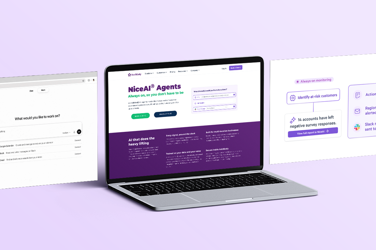
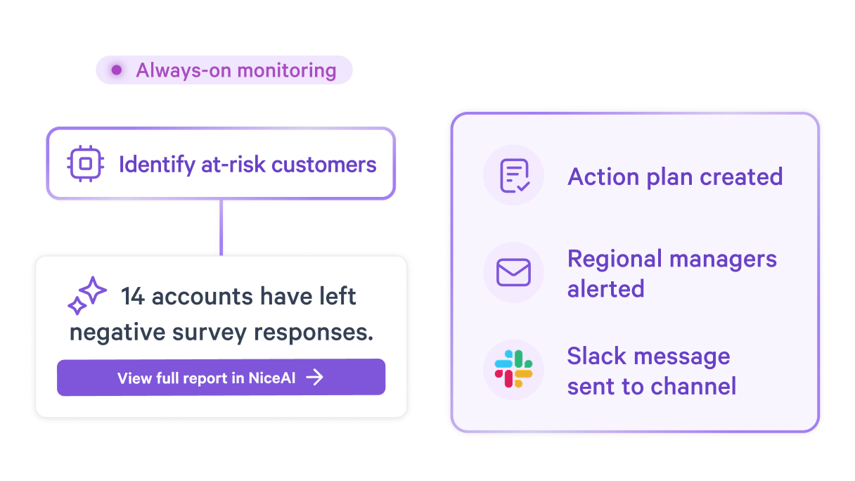
This is the limitation dedicated CX platforms like AskNicely are built to fix, and it's exactly what AskNicely's NiceAI® Agents are designed for. Instead of someone manually running analysis on a schedule, an Insights Agent watches every survey response and online review continuously, flags score drops, emerging themes, and location-level outliers as they happen, and sends the finding straight to email, Slack, or Teams, no CSV export required.
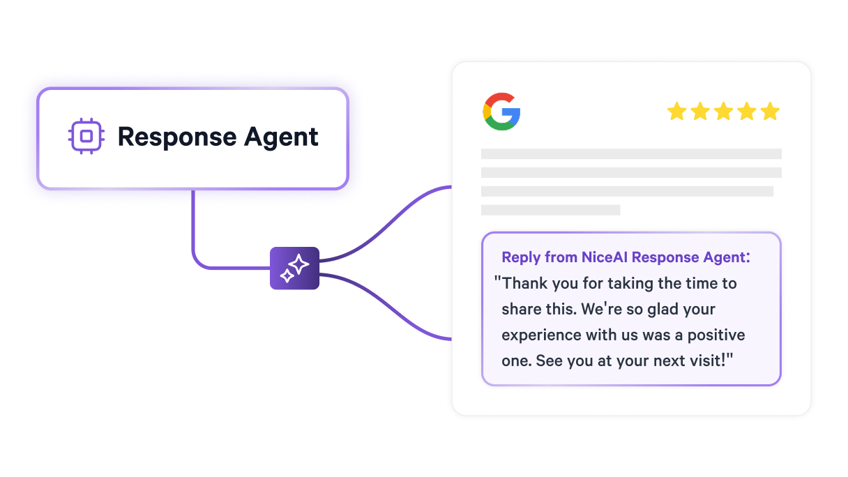
A Response Agent handles the reply side of the same problem, drafting on-brand responses to reviews and survey comments as they come in, so feedback volume stops being the bottleneck to a personal-feeling reply. And where manual analysis stops at "here's what customers said," a Review Routing Agent acts on it directly, prompting customers for reviews at the moment they're most likely to leave one and directing them to whichever platform needs it most.

For businesses whose goal is changing behavior at the point of service, not just producing a monthly report, that's the difference between insight that arrives too late to matter and insight that reaches someone while they can still act on it. This is the natural next step once DIY analysis has done what it can: the point where a team needs feedback moving on its own, continuously, without someone at the keyboard running the prompts.
Learn more about NiceAI agents here.
There's no hard cutoff, but a useful rule of thumb: once you're past a sample size of 30-50 responses per segment (per location, per month), manual reading starts costing more time than AI analysis. Below that, you can usually read every comment yourself in a few minutes and won't miss much. Above it (especially once you're comparing multiple locations) patterns start hiding in volume that a quick skim won't catch. If you're at 2,000 responses like the clinic example, AI isn't optional at that point, it's the only realistic way to use the data at all.
Only in a limited way. Free tier users have access to a range of chat capabilities and tools, but advanced functionality including data analysis and file uploads can have stricter limits than paid plans. In practice, free users get 3 file uploads per day and don't get access to Advanced Data Analysis, just basic document reading. For genuine survey analysis ( theme detection, correlations, segment comparisons) a paid plan is worth the $20/month. If budget is the blocker, Claude and Gemini both offer comparable free-tier constraints, so shopping around won't solve it; budgeting for one paid tool will.
Modern LLMs handle multilingual data well without translation as a separate step. Upload the file as-is and tell the AI explicitly: "This CSV contains responses in English and Spanish. Analyze all responses together and translate any non-English quotes you reference into English." It'll read both languages natively and fold them into one unified theme analysis, rather than treating them as separate datasets. If a location serves a specific language community heavily, it's worth asking the AI to flag whether themes differ by language — sometimes they do, and that's its own insight.
Treat the mismatch as a signal, not a dead end. First, check whether the AI has full context, an incomplete or poorly labeled CSV produces confidently wrong conclusions. Second, ask it directly: "This finding doesn't match what we're seeing operationally. What in the data supports this conclusion, and what might explain the difference?" Often the AI is technically right about the data but missing an operational factor you know and it doesn't e.g., a renovation, a new competitor, a change in service mix. Your on-the-ground knowledge and the AI's pattern-detection are supposed to check each other, not replace one another.
Don't ask them to trust it blindly, show them the data behind it. Every AI output should come with evidence: response counts, example quotes, the specific prompt used. Run one analysis in parallel with a manual review the team already trusts, and compare results side by side. Teams come around fastest when they see AI catch something a manual read missed, or confirm something they already suspected but couldn't prove with numbers. Skepticism is healthy here; it usually resolves once the process is transparent rather than a black box.
Analyze all of it. Negative feedback tells you what to fix, but positive feedback tells you what to protect and scale, and that's just as tied to revenue. A location with unusually positive comments about a specific staff member or process is showing you a repeatable win, not just a nice-to-know. Filtering to negative-only also skews your read on overall sentiment and can make a genuinely strong location look average because the good feedback never entered the analysis. Run the full dataset, then segment by sentiment afterward if you need to prioritize.